Serendipity and geometry decided our startup’s name and logo
It was a hot, sweaty December mid-morning in Singapore last year, when Arun and I took a bus to the nearby Starbucks to meet a large cloud solutions provider. We were happy with our existing setup but exploring newer, better options. We had a lengthy meeting full of technical discussions and business outlook, along with our product demo and description. We didn’t really get what we were looking for from the guy, and it was clear about 5 minutes in, that the meeting would be a wipeout. We enjoyed the coffee (and the air-conditioning), but as we got up to leave, the guy said something that made the meeting unforgettably impactful for us.
“This is great, what you guys are doing - it’s like the seven degrees of separation, you know. Everyone can see how they are related to friends’ friends. It’s cool.”
Even as I mentally corrected him in my mind from 7 to 6, Arun and I instantly knew what we were going to call our product. We’d been looking for a new name for a while (we used to call it Livebook internally earlier, before we made it public) and all our naming ideas had started to sound bad after just a few hours of thinking. I guess it’s a bit like naming a baby - without the gender considerations. You really want to get it absolutely perfectly right. And serendipitously, we’d got our “perfect” name from a total stranger.
Sadly, serendipity didn’t help us much in our search for a logo.
As any basic google search will tell you, 6degrees is the popular theory originally set out by Frigyes Karinthy and popularized by a play written by John Guare – that everyone and everything is six or fewer steps away, by way of introduction, from any other person in the world. This, in essence is what 6degrees is all about – to be a network of contacts where everyone is connected in some way.
To begin with, we had chosen a name that didn’t directly convey our product’s features (unlike Mcdonald’s burgers, for example). Our choice was subtler, and most people in our circles didn’t know separation theory. However, we could still aim to create a relatively simple logo that didn’t clash with the name, and yet capture the user’s psycho-optical attention. Unlike a Whatsapp, a very simple name that has a chat app screaming from its logo itself, we were more like a Firefox - a more attractive name, which simply translated the attractiveness of the name to the logo. This post is not to justify our choice or to write a how-to - it is merely our story. There are often multiple correct answers in such situations.
Our designer Aen, who I think is hands-down the best UX guy in Singapore, accepted our simple principles and allowed his sense of geometry to do the magic.
The mathematical constructs in the logo’s geometrical form are:
- Continuity
- Hexagon
- Equilaterals
Continuity
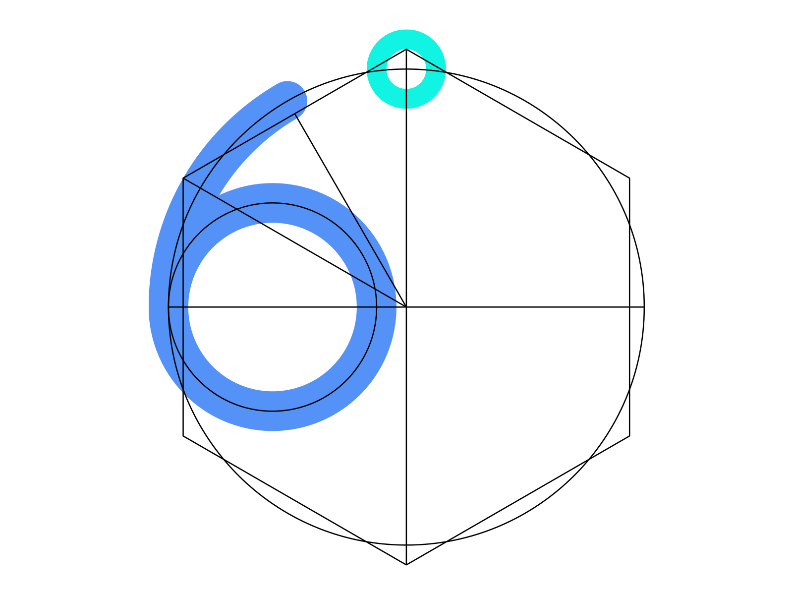
Instead of placing the degree symbol in an arbitrary position, he used the ascender of the 6 as the guide and placed it along the outer curve.
![]()
The counter of the 6 is also placed in the same continuum as the ascender in a configuration similar to the Large Hadron Collider which accelerates protons from the smaller circle into the large circle.
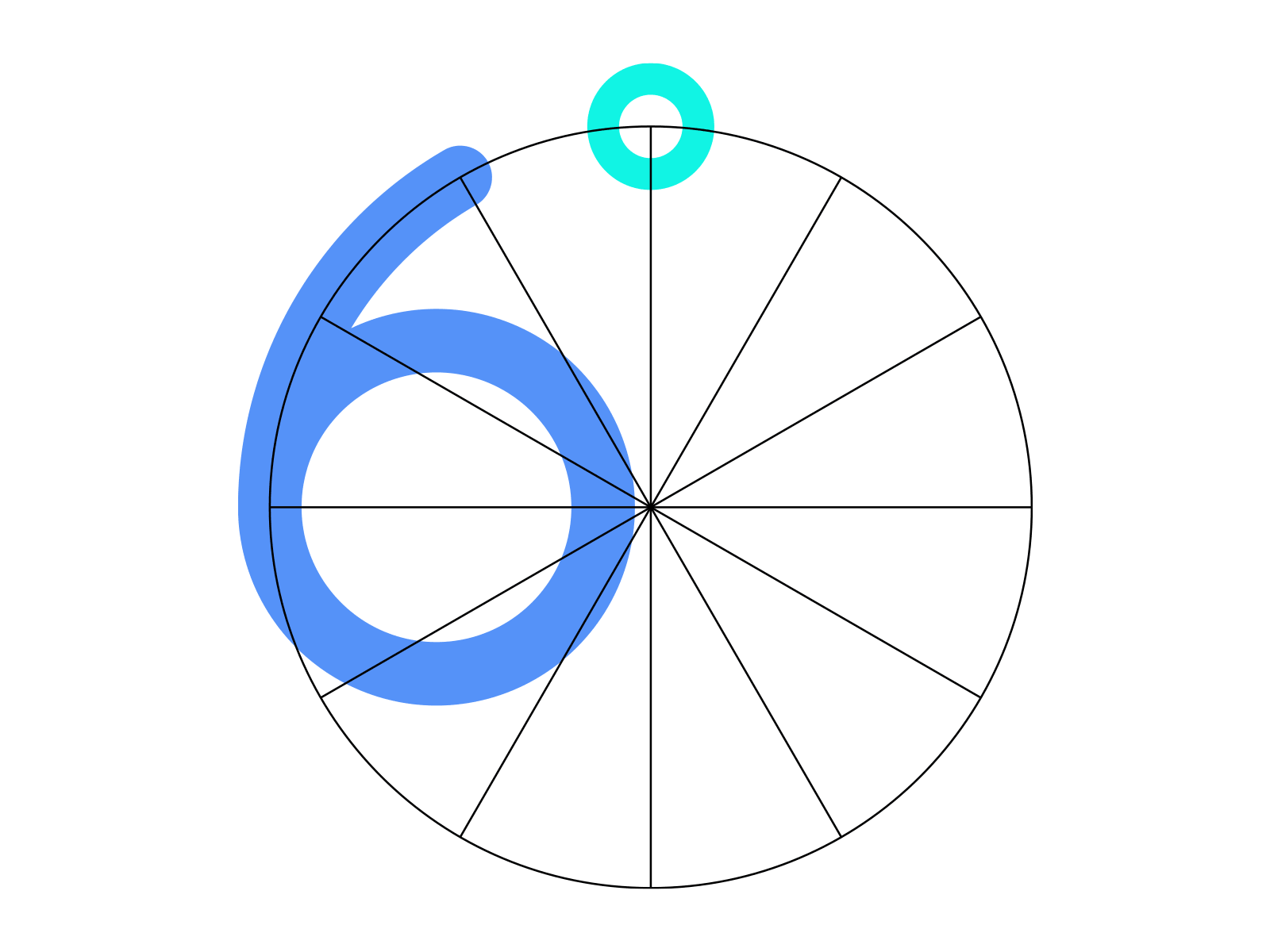
Hexagon
Being six-sided, the hexagon is the perfect polygon to communicate the concept of six degrees of separation. The hexagon is also one of the most efficient shapes in nature. Bees instinctively construct their hives as three-dimensional hexagons because they make for robust structures that cost the least wax. Since 6degrees is very much about maintaining a clean and efficient contact list, having a hexagonal frame makes sense.
Graphite is made up of layers of graphene, each a single atom thick. In graphene carbon atoms are arranged in a hexagonal grid. Carbon nanotubes which are essentially rolled up tubes of graphene owe their strength to this hexagonal nature. Equilaterals
Hexagons have internal angles of 720°. Each vertice is 120°. A hexagon can be sliced into six equilateral triangles. Each one can be half into two right-angle triangles. Overlaying the hexagon over the outer circle, he broke it into twelve equal parts.
The four equal segments of the top-left quadrant of the cake determine the symmetry of the 6 and the distance from the terminal to the degree symbol. This manner of constructing the 6 feels stable and balanced. As a result the 6 despite being heavier on its left side stays in equilibrium because of its attachment to the degree symbol.
So there it is - that’s how we got our logo.
blog comments powered by Disqus